pacman::p_load(tidyverse, plotly, crosstalk, DT, ggdist, gganimate, ggplot2, dplyr)Hands-on_Ex4-2 Visualising Uncertainty
10.1 Learning Outcome
10.2 Visualizing the uncertainty of point estimates
A point estimate is a single number, such as a mean.
Uncertainty is expressed as standard error, confidence interval, or credible interval
Important:
- Don’t confuse the uncertainty of a point estimate with the variation in the sample
exam <- read_csv("data/Exam_data.csv")10.2.1 Visualizing the uncertainty of point estimates: ggplot2 methods
The code chunk below performs the followings:
group the observation by RACE,
computes the count of observations, mean, standard deviation and standard error of Maths by RACE, and
save the output as a tibble data table called
my_sum.
my_sum <- exam %>%
  group_by(RACE) %>%
  summarise(
    n=n(),
    mean=mean(MATHS),
    sd=sd(MATHS)
    ) %>%
  mutate(se=sd/sqrt(n-1))
Note: For the mathematical explanation, please refer to Slide 20 of Lesson 4.
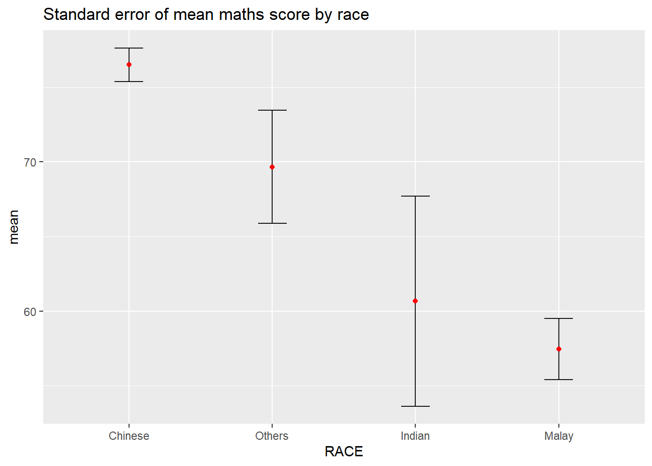
knitr::kable(head(my_sum), format = 'html')| RACE | n | mean | sd | se |
|---|---|---|---|---|
| Chinese | 193 | 76.50777 | 15.69040 | 1.132357 |
| Indian | 12 | 60.66667 | 23.35237 | 7.041005 |
| Malay | 108 | 57.44444 | 21.13478 | 2.043177 |
| Others | 9 | 69.66667 | 10.72381 | 3.791438 |
10.2.2 Visualizing the uncertainty of point estimates: ggplot2 methods
The code chunk below is used to reveal the standard error of mean maths score by race.
ggplot(my_sum) +
  geom_errorbar(
    aes(x=RACE,
        ymin=mean-se,
        ymax=mean+se),
    width=0.2,
    colour="black",
    alpha=0.9,
    size=0.5) +
  geom_point(aes
           (x=RACE,
            y=mean),
           stat="identity",
           color="red",
           size = 1.5,
           alpha=1) +
  ggtitle("Standard error of mean maths score by race")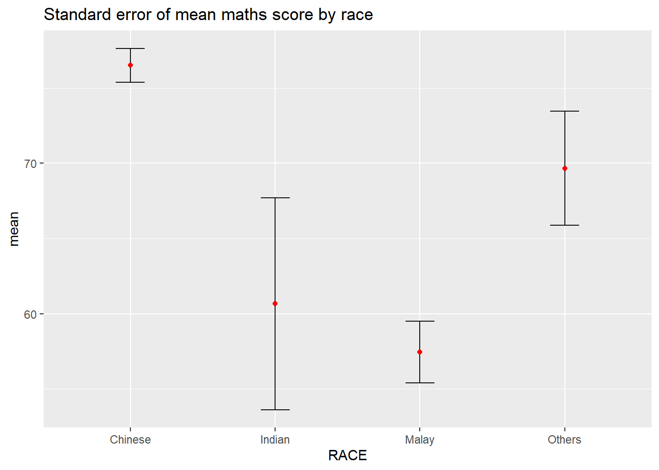
10.2.3 Visualizing the uncertainty of point estimates: ggplot2 methods
my_sum_sorted <- my_sum %>%
  arrange(desc(mean)) %>%
  mutate(RACE = forcats::fct_reorder(RACE, -mean))


ggplot(my_sum_sorted) +
  geom_errorbar(
    aes(x=RACE,
        ymin=mean-se,
        ymax=mean+se),
    width=0.2,
    colour="black",
    alpha=0.9,
    size=0.5) +
  geom_point(aes
           (x=RACE,
            y=mean),
           stat="identity",
           color="red",
           size = 1.5,
           alpha=1) +
  ggtitle("Standard error of mean maths score by race")